Mobile vs. VR: Key Differences in Features, UI, and UX

Hello, there!
When you move from building mobile apps to building for VR, a lot of familiar ideas stay the same, but many details work differently in practice. And just like with mobile, you still need to think about typography, animations, interactions, contrast, and element sizing; all the small things that shape the overall experience.
In the previous article, we focused mostly on the requirements you need to meet when shipping a Meta Quest app. At that point, you might have wondered: How do I actually implement these requirements in React Native? This article connects those dots and explains what changes when you design for VR instead of mobile, and how to approach those differences in your code.
If you’ve been following our React Native for Meta Quest series, you’ve already seen bits and pieces of these differences. Here, we fill in the missing gap and walk through the practical adjustments you’ll make when moving your mindset from mobile screens to VR windows.
To find out about general rules and key considerations when working on 2D apps for Meta Quest, check out the official documentation.
Windowing and layout behavior
On mobile, the environment is predictable: your app typically runs full screen, within a small set of aspect ratios and orientations, and the viewport doesn’t change while the app is open. You might support rotation or a tablet layout, but the underlying layout model is still largely stable.
On Meta Quest, the environment is inherently flexible. Users can move your app around them, resize it on the fly, and interact with system-provided window controls that appear on hover. Instead of designing for a single, fixed plane, you need to assume your UI behaves like a small desktop window that can grow, shrink, and reposition at any time.
This makes responsive design a first-order requirement. Meta’s guidance for 2D apps specifies a default viewport of around 1000 × 625 pixels and clearly states that users can change those dimensions. Design your layout and typography to adapt gracefully across a range of sizes, rather than being tied to a phone-like frame.
In practice, it’s closer to designing for a compact desktop environment. Both Apple with iPadOS windows and Android with foldables are moving in a similar direction, so this is also a chance to future-proof your cross-platform app.
To support resizing in React Native:
- Use Flexbox as your base layout system.
- Use
useWindowDimensionsor Dimensions API when window size changes.
If you’re using React Navigation, useFrameSize gives you direct access to window size changes.
Here’s an example use on how to track window change:
const TWO_PANE_MIN_WIDTH = 960;

const {height, width} = useWindowDimensions();

const [twoPane, setTwoPane] = useState(
  width >= TWO_PANE_MIN_WIDTH
);

useEffect(() => {
  setTwoPane(width >= TWO_PANE_MIN_WIDTH);
}, [width]);
If you want to implement more advanced techniques, you’ll need to reach for external libraries, such as Unistyles V3, which will allow you to implement media queries and breakpoints.
Styling
In VR, styling is not just about making things look nice. Text, icons, and colors all affect how comfortable it is to look at your app for more than a few minutes. What feels “small but fine” on a phone can quickly become unreadable or tiring when it floats in front of you inside a headset. In practice, there are four big pieces to keep an eye on:
- Typography
- Icons
- Color and contrast
- Visual hierarchy and spacing
Typography
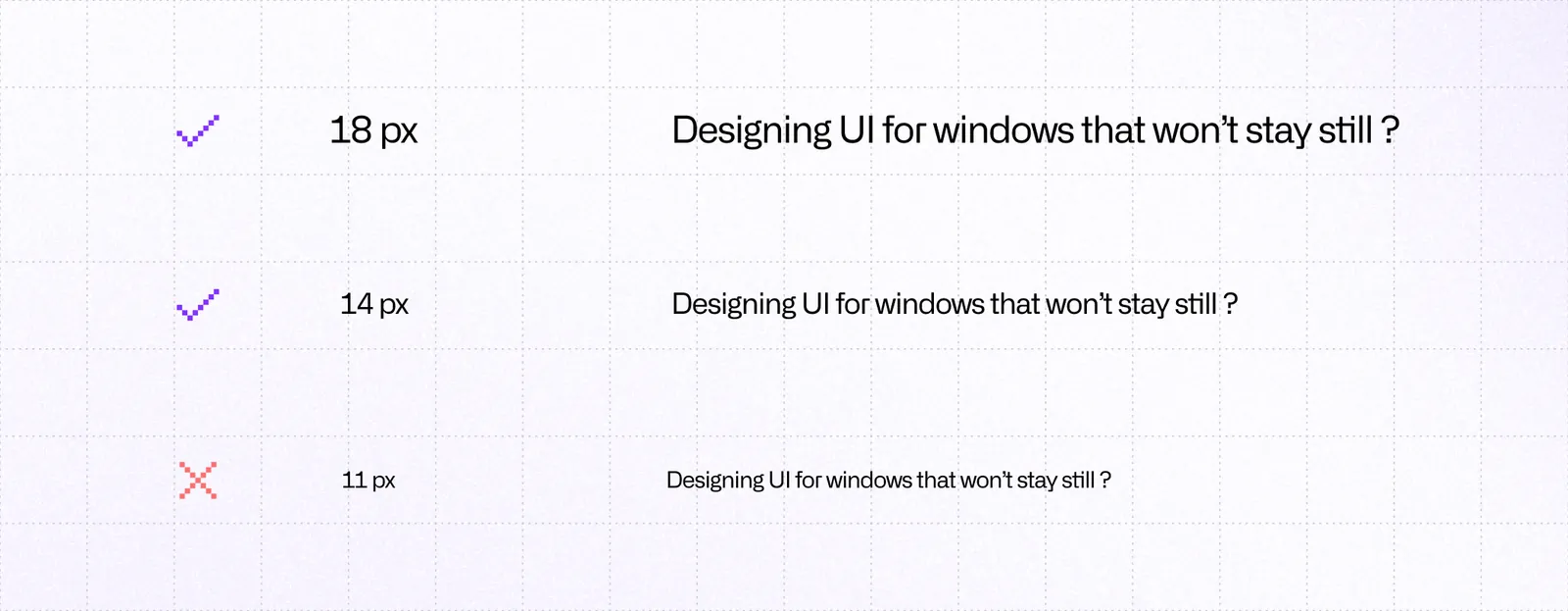
Meta recommends a font size of at least 14 px for minimal legibility and at least 18 px for comfortable reading in a headset. That is usually larger than what you might get away with on a phone, so if you are porting an existing mobile UI, assume you will need to bump body text and possibly titles.
Stick to simple, sans‑serif fonts with a high x‑height and open counters. The Inter font used in the Meta Horizon OS UI Set is a good default. Use heavier weights like Regular, Medium, and Bold for key copy and keep light weights for large display text only.
Icons
In a headset, icons carry even more weight than on mobile. They are faster to parse than text, stay readable when you are slightly further away, and help you rely less on tiny labels that strain the eyes.
In React Native, you usually render icons via:
- A vector‑icon library such as
react-native-vector-iconsor a design‑system‑specific package. - Custom SVGs via something like
react-native-svg.
Map Meta’s guidance to React Native like this:
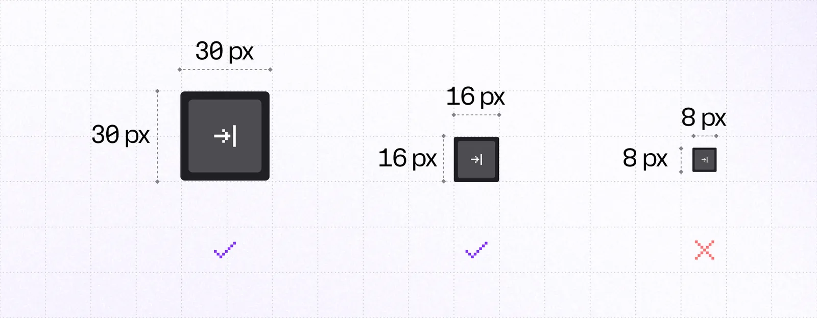
- Treat
size={24}as your default for action icons, andsize={12}or16for compact status indicators. That lines up with the 24 dp / 12 dp / 16 dp system sizes from the Horizon OS icon set. - Prefer filled variants for Quest builds. If you share code with mobile, you can swap between outline and filled icons per platform while keeping the same names and semantics.
- Keep icons visually simple and avoid very thin strokes. In practice, use the “regular” or “filled” weights from your icon set rather than ultra‑thin styles.
- Make sure the tap target is larger than the icon itself. An icon can be 24 dp visually but sit inside a 48 dp pressable area so it remains easy to hit. You can either wrap it in a container with padding, or use
hitSloponPressableand keep the visuals tight.
Colors and contrast
Your app’s window can appear over almost anything: a dark room, a bright passthrough, or another 3D environment. Background brightness and motion can vary dramatically, so contrast is what keeps your UI legible and comfortable. Poor contrast not only hurts accessibility but can cause physical eye fatigue in VR.
Use WCAG 2.1 ratios as your baseline to ensure sufficient contrast between text and background. React Native DevTools or your design tool allow you to run contrast checks against the WCAG AA thresholds.
Visual hierarchy and spacing
Even in a 2D window, spatial organization matters. In VR, it matters more, because users rely on subtle spacing to parse what’s clickable and where to focus.
- Maintain generous spacing between interactive elements (at least 8-12 dp between buttons or icons).
- Group related controls together and separate groups with extra padding.
- Avoid edge crowding; leave margin around window edges so text or icons don’t feel cut off.
- Use shadow and elevation sparingly to show layering; too much depth or blur can look unnatural.
- Keep focus cues obvious; highlights, glows, or small scale changes help users know what’s active.
These details add up. When users can instantly read, recognize, and interact without squinting or overshooting, the experience feels effortless; that’s the ultimate goal.
Accessibility and comfort
For many developers, accessibility is a similar oversight to writing tests. It may often seem like an unnecessary cost that does not bring much benefit to most users. Things like color contrast, good typography, appropriate icon and button sizes, and well-defined layout and spacing will make using your app a joy.
Users may not always be able to describe what works or what doesn’t in an interface, yet they instantly sense when something has been carefully designed. That applies to everyone, whether they rely on screen readers, higher contrast, larger text, or any other accommodation.
Use the points below as general rules that you need to keep in mind when working on your app:
- Make controller use simple.
- Reduce the amount of key presses.
- Allow users to set and save their preferences.
- Allow user to remap control schemes.
- Provide sound effects and haptic feedback (when using controllers) for additional feedback.
- Avoid excessive need to move head.
Provide designs that work well whether the user interacts with controllers or hand tracking. Meta’s guidelines on comfort and spacing are helpful for planning layouts that feel easy to use in 3D space.
Sessions are shorter on VR than on PC, so make sure to cut the time needed for users to engage with the core functionality of your app.
Use accessibility features built into Meta Quest to verify if you handle requirements correctly. React Native DevTools can help you with inspecting the size of elements, spacing, and color contrast.
Interactivity
Interactions in VR rely heavily on clear feedback. Users point at elements, hover over them, and expect the interface to respond in a way that feels natural in a 3D space. This makes animations and hover states more important than they typically are on mobile.
Track it using onHoverIn event to give the user a visual cue that they’re pointing at something interactive. Anytime a user clicks, drags, or interacts in any other way with an element, the UI should reflect that to help the user orient themselves to what’s happening in the given moment.
Use libraries like react-native-reanimated and react-native-gesture-handler to implement those interactions. Start by giving users immediate feedback for hover and press actions:
<Pressable
  onHoverIn={() => setHovered(true)}
  onHoverOut={() => setHovered(false)}
  onPress={() => console.log('Clicked!')}
  style={[
    styles.button,
    hovered && styles.buttonHovered,
  ]}
>
  <Text>Click me</Text>
</Pressable>
There’s no need to implement everything from scratch. You can tap into a vast ecosystem of component libraries and tools that help you achieve great UX; think libraries like pressto, react-native-aria, and others.
Touch targets should still follow the familiar minimum size of 48 dp × 48 dp. It’s the same as on Android, so if you follow the guidelines, you should already meet that criterion.

If your element is visually smaller than that, consider adding invisible hit slop to make it easier to select without changing how it looks.

Other considerations
Navigation
On Meta Quest there is no universal system Back button. Meta’s design requirements ask you to include an in‑app back control when needed so people can always return or dismiss, whether they use controllers or hand tracking. In React Native, make this explicit rather than relying on platform buttons. If you use React Navigation, add a visible back affordance in your header or screen chrome and wire it to navigation.goBack(). Keep a consistent location and label so it is easy to find.
Platform
When you need Quest‑specific defaults, branch lightly. Use React Native’s Platform to separate iOS and Android, then detect Quest using ExpoHorizon.isHorizonDevice at runtime to fine‑tune spacing, breakpoints, or densities without hard‑forking layouts:
import { Platform } from 'react-native';
import ExpoHorizon from 'expo-horizon-core';

// use ExpoHorizon.isHorizonDevice to detect Meta Quest and Platform.OS for other systems
function getPlatform() {
	if (ExpoHorizon.isHorizonDevice) {
		return "horizon";
	}

	return Platform.OS;
}
AI
Keeping up with all these requirements is a big challenge, and things can easily slip through. This is where AI shines. Thanks to Meta’s and Expo’s MCPs, you can ask your favorite LLM to go through your codebase and look for violations or improvement ideas based on rules and requirements for Meta Quest apps.
VRC
Treat VRC (Virtual Reality Check) like a living checklist. Entitlement check, lean permissions, no head‑locked UI, and robust pause behavior cover a surprising amount of the review surface. They’re similar to Core app quality guidelines for Android, so if you’ve reviewed them before, VRC checks should be familiar to you.
Summary
Designing for VR changes the assumptions you rely on in mobile work. Windows resize, interactions happen at a distance, and comfort matters as much as visual style. If you treat responsiveness, legibility, accessibility, and clear feedback as core parts of your UI, your React Native app will feel at home on Meta Quest.

Learn more about Virtual Reality
Here's everything we published recently on this topic.