Bringing CSS Clipping to React Native

If you've ever tried to create angled headers or any other non-rectangular section dividers in React Native, you've probably felt that something is missing. On the web, CSS clip-path makes these shapes trivial.
.star-badge {
  clip-path: polygon(50% 0%, 61% 35%, 98% 35%, 68% 57%, 79% 91%, 50% 70%, 21% 91%, 32% 57%, 2% 35%, 39% 35%);
}
But sadly, it’s not available for React Native apps, so we need to import a third-party library:
import {MaskedView} from ...
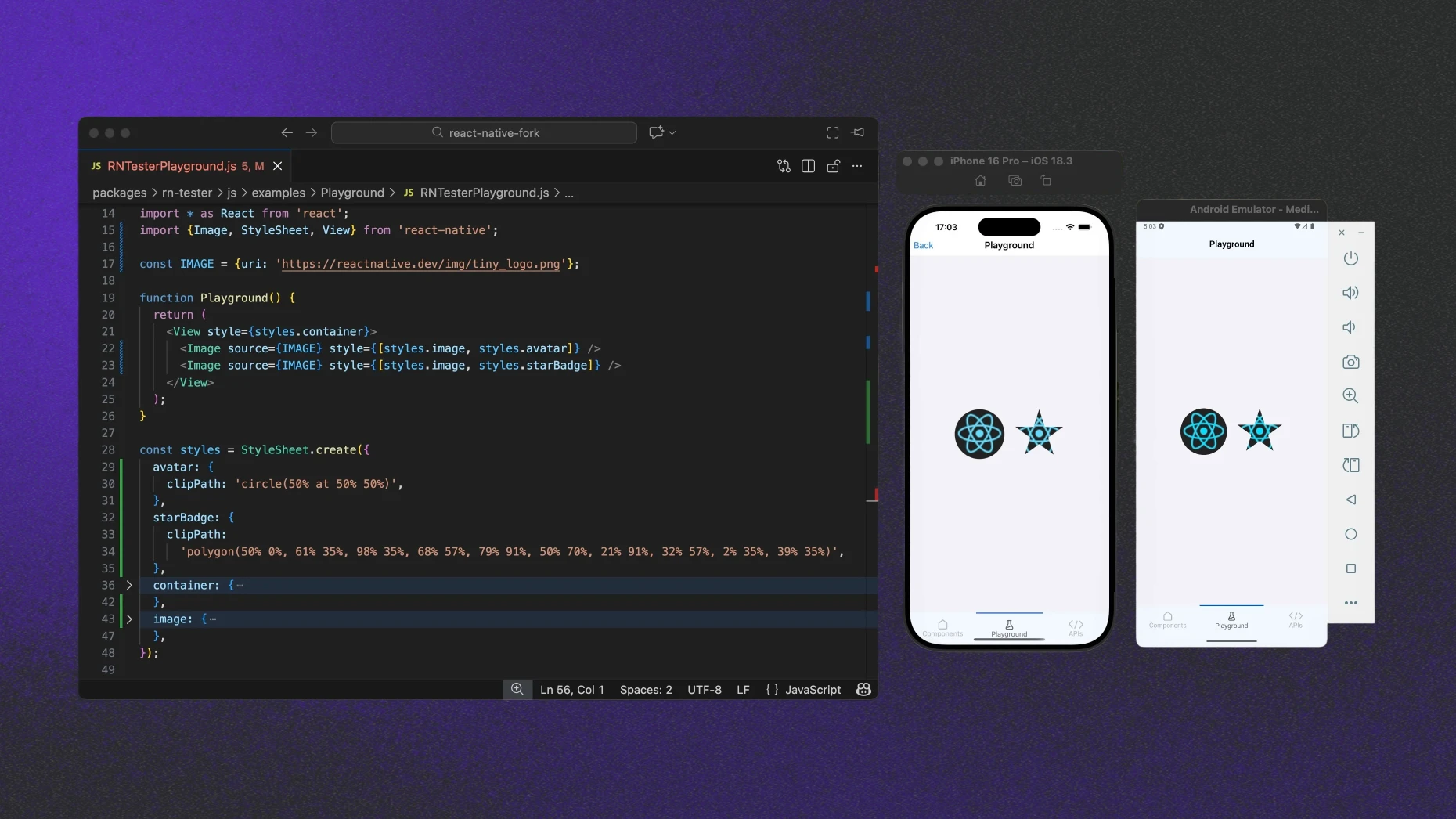
<MaskedView path="..." />The effect of this code is this pretty shape:
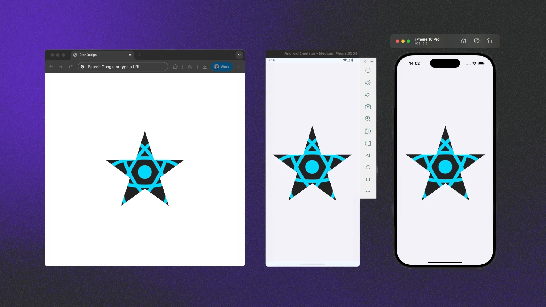
We ended up with cross-platform star-shape masking. The code, however, looks quite different for web and mobile platforms. In this article I’d like to explore what it would take for React Native to support masking with clip-path natively through the CSS-like StyleSheet API and propose solutions.
What is CSS clip-path?
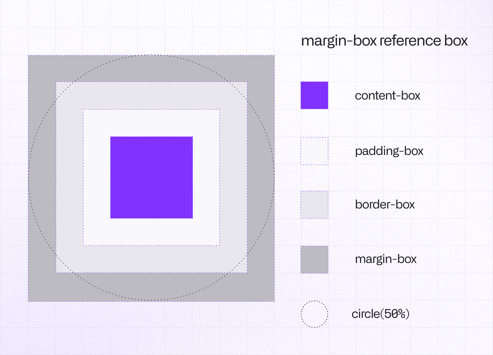
The clip-path CSS property defines a clipping region that acts like a mask: only the parts of an element that fall inside the region are visible, while everything outside is hidden. This region is described by two components: the shape itself and the geometry box that determines how that shape is positioned and sized.
The Shape Function
This defines the geometry of your cut. You can use helper shape functions (circle(), polygon(), inset(), …) or point to a local or remote resource (url(image.png)).
SVG images won’t be supported in the first version ofclip-pathimplementation for React Native;path()shape does not work.
The Geometry Box
This is the reference frame. It tells the renderer which part of the element's "box" to use as the starting point for your shape's coordinates (0,0). The default is border-box, but you can also use padding-box, content-box or margin-box.
clip-path in Action
.avatar {
  clip-path: circle(50%);
}

.star-badge {
  clip-path: polygon(50% 0%, 61% 35%, 98% 35%, 68% 57%, 79% 91%, 50% 70%, 21% 91%, 32% 57%, 2% 35%, 39% 35%);
}
Styles as presented above should result in the following view.
.png)
Why React Native Is Different
On the web, the rendering stack is unified under a single engine such as Blink. It parses CSS and computes layout. Then it uses a graphics engine like Skia to paint every pixel on the screen.
In contrast, React Native doesn't draw its own UI by default. Instead, React Native acts as a coordinator. It translates your styles into layout instructions, which the host operating system (iOS or Android) draws using native UI kits.
Essentially, the web simulates a UI inside a browser window, while React Native assembles a UI using the phone's native building blocks.
At the same time, React Native gives us a subset of CSS to use, but not everything. Let's see how this works in practice using the clip-path example.
From Style to Screen
React Native architecture can be treated as a distributed system. It coordinates work across various pieces. This means that to add support for the new attribute, we have to touch and modify a lot of different parts of it.
Let's tackle them one by one.
The journey starts when you write a sample clipPath: 'circle(50% at 25% 25%)' definition in your styles.
Starting at the JS Layer
React files have to be aware of the appearance of our new attribute, thus we need to ensure its visibility to TypeScript or Flow. Its argument is just the text, so it should be as easy as the following change, right?
export type ____ViewStyle_InternalBase = $ReadOnly<{
   // ...
   isolation?: 'auto' | 'isolate',
+  clipPath?: string,
}>;
Well, not really. The JS layer is also responsible for parsing the argument's value and converting it into an object structure, that is later processed by the native code. It means that we also need to add parsing functionality and relevant types that describe the possible new clipPath input schema.
It has to come along with tests and a few other minor touches. I will skip these parts to keep this article short and to-the-point. Let's see what happens when our new CSS attribute value, in form either of parsed object or a raw string, is passed on to the React Native C++ core layer.
Recently React Native core team added a new, native CSS parser. It means that attribute text values can be parsed, tokenized and converted to native types directly by C++ code! This not only offers a slight performance boost but is also the technically correct approach. However, it's currently in development and hidden by an internal feature flag. I am looking forward to seeing it enabled by default.
C++ as the Source of Truth
React Native's new architecture renderer (a.k.a. Fabric) uses C++ as a shared core between platforms. This is the layer that enables true cross-platform compatibility. The received clip path data needs to be represented in C++ so that both iOS and Android (and other platforms such as Windows, which recently adopted New Architecture by default in v0.81) can consume it.
But let's start from the beginning. To understand how a change of CSS property results in a re-rendered application, we need to walk end-to-end and briefly explain the render pipeline of React Native.
Let's see step by step what changes are required at any specific point to add our new CSS attribute functionality.
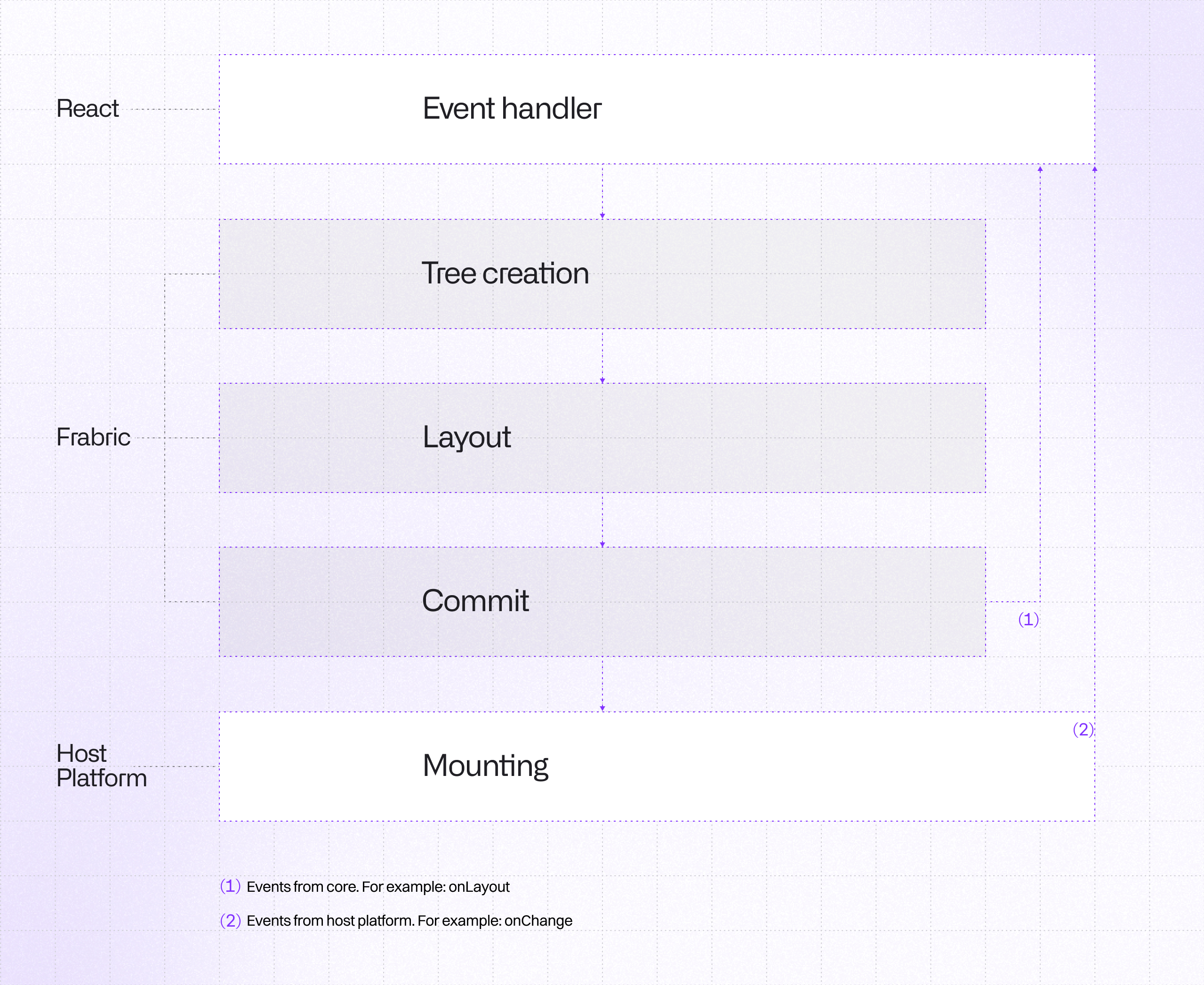
If you would like to dive deeper into React Native's new render pipeline, it is very well described in the official documentation of the New Architecture, especially check the Render, Commit, and Mount section.
Everything starts from the process called Reconciliation. During this stage, called Render Phase, React's reconciler computes the diff between old and new props, detects changes to props, and schedules a re-render. The changes in this step were discussed in the previous paragraph.
When props change, React clones Shadow Node with new props. Unlike the old architecture, where this was a slow, asynchronous message to a separate thread, this now happens through direct JSI calls.
Why cloning is helpful here?
Shadow Tree Nodes are immutable due to thread safety reasons. To change the CSS attribute, the renderer cannot mutate the existing node. It has to clone the affected Shadow Node with the new prop. It uses structural sharing to refer back to the old nodes that didn't change, minimizing memory overhead.
That’s the place we need to step in.
Shadow Node is a representation of a React Shadow Tree element. It contains props that originate from JavaScript along with layout information. We need to expand the list of properties and add a new one.
namespace facebook::react {

class BaseViewProps : public YogaStylableProps, public AccessibilityProps {
	 // ...

   // Color
   Float opacity{1.0};
   SharedColor backgroundColor{};

   // Borders
   CascadedBorderRadii borderRadii{};
   CascadedBorderColors borderColors{};

 	 // ...
+  std::optional<ClipPath> clipPath{};
}

} // namespace facebook::react
Integrating clipPath into the BaseViewProps class definition
std::optional<T> means in the C++ world that the property is nullable, and ClipPath is our new type that represents this attribute. It generally looks like this:
namespace facebook::react {

// Define individual geometric primitives used for clipping
struct CircleShape {
  std::optional<ValueUnit> r{};
  std::optional<ValueUnit> cx{};
  std::optional<ValueUnit> cy{};
	// ...
};

struct EllipseShape {
  std::optional<ValueUnit> rx{};
  std::optional<ValueUnit> ry{};
  std::optional<ValueUnit> cx{};
  std::optional<ValueUnit> cy{};
  // ...
}
...
// A type-safe union representing any possible basic shape
using BasicShape = std::variant<
	CircleShape,
	EllipseShape,
	InsetShape,
	PolygonShape,
	RectShape,
	XywhShape>;

// Standard box model enumerations for the clip reference box
enum class GeometryBox : uint8_t {
  MarginBox,
  BorderBox,
  ContentBox,
  PaddingBox
};

// Main structure representing a full clip-path value
struct ClipPath {
  std::optional<BasicShape> shape;
  std::optional<GeometryBox> geometryBox;

  bool operator==(const ClipPath &other) const;

// Debugging and serialization helpers
#if RN_DEBUG_STRING_CONVERTIBLE
  std::string toString() const;
#endif

#ifdef RN_SERIALIZABLE_STATE
  folly::dynamic toDynamic() const;
#endif
};

} // namespace facebook::react
Data structures for the clip-path property implementation
We need to ensure that, as the CSS specification says, the clip-path attribute should result in the creation of a stacking context.
It requires a small modification of ViewShadowNode class, which is the Shadow Node representation of <View> component to be mounted. Lack of this adjustment would lead to unexpected results, such as not clipping children of the component.
void ViewShadowNode::initialize() noexcept {
  // ...
  bool formsStackingContext = !viewProps.collapsable ||
      viewProps.pointerEvents == PointerEventsMode::None ||
      !viewProps.nativeId.empty() || viewProps.accessible ||
      viewProps.opacity != 1.0 || viewProps.transform != Transform{} ||
      (viewProps.zIndex.has_value() &&
       viewProps.yogaStyle.positionType() != yoga::PositionType::Static) ||
      viewProps.yogaStyle.display() == yoga::Display::None ||
      viewProps.getClipsContentToBounds() || viewProps.events.bits.any() ||
      isColorMeaningful(viewProps.shadowColor) ||
      viewProps.accessibilityElementsHidden ||
      viewProps.accessibilityViewIsModal ||
      viewProps.importantForAccessibility != ImportantForAccessibility::Auto ||
      viewProps.removeClippedSubviews || viewProps.cursor != Cursor::Auto ||
      !viewProps.filter.empty() ||
      viewProps.mixBlendMode != BlendMode::Normal ||
      viewProps.isolation == Isolation::Isolate ||
      HostPlatformViewTraitsInitializer::formsStackingContext(viewProps) ||
      !viewProps.accessibilityOrder.empty() ||
+     viewProps.clipPath.has_value();
  // ...
  if (formsStackingContext) {
    traits_.set(ShadowNodeTraits::Trait::FormsStackingContext);
  } else {
    traits_.unset(ShadowNodeTraits::Trait::FormsStackingContext);
  }
  // ...
}
Updating Stacking Context logic to include clip-path
When Rendering is finished, commit of Shadow Tree is triggered. It promotes the new tree as the “next tree” to be mounted, and also schedules calculation of layout (Yoga).
The next, and the last phase is Mounting: transforming React Shadow Tree into a Host View Tree.
It includes three steps:
- Tree Diffing, where computation of the diff between previous and the next tree happens.
- Tree Promotion to ensure the next mount phase computes a diff against proper tree.
- View Mounting, where the actual rendering changes have to occur.
Okay, we know how information about a property change is propagated from JavaScript up to the Host Platform level. Let's now explore how the actual implementation of clip-path looks for iOS and Android.
Clipping on iOS
React Native uses UIKit to handle and build UI elements, and its most fundamental building block is UIView. In UIKit, every UIView is backed by a CALayer (Core Animation Layer). While the view handles user interactions like touches, the layer is what actually renders the content on the screen and acts like a canvas. Each layer has a mask property that acts as a transparency mask - telling what should be visible and what should be hidden. With that knowledge, let's get down to implementation!
Fortunately for us, there is one custom React Native iOS class (RCTViewComponentView) that extends UIView and every type of created View, no matter if it is <View> or <Image>, inherits from it. This means we only need to add our clip-path logic there and it will work for every React Native component! The place we are looking for is invalidateLayer function, it has to be extended by the block of code shown below.
- (void)invalidateLayer
{
	// ...
  // Handle clip-path property
  if (_props->clipPath.has_value()) {
    CALayer *maskLayer = [RCTClipPathUtils createClipPathLayer:_props->clipPath.value()
                                                 layoutMetrics:_layoutMetrics
                                                     yogaStyle:_props->yogaStyle
                                                        bounds:layer.bounds
                                                   cornerRadii:RCTCornerRadiiFromBorderRadii(borderMetrics.borderRadii)];
    if (maskLayer != nil) {
      self.currentContainerView.layer.mask = maskLayer;
    }
  }
  // ...
}
Modifications to invalidateLayer function
Where createClipPathLayer is a helper function responsible for calculating the geometry-box and creating the shape path. Let’s take a look at its breakdown.
+ (CALayer *)createClipPathLayer:(const ClipPath &)clipPath
                   layoutMetrics:(const LayoutMetrics &)layoutMetrics
                       yogaStyle:(const facebook::yoga::Style &)yogaStyle
                          bounds:(CGRect)bounds
                     cornerRadii:(RCTCornerRadii)cornerRadii
{
  CGRect box = [self getGeometryBoxRect:clipPath.geometryBox
		                      layoutMetrics:layoutMetrics
			                        yogaStyle:yogaStyle
bounds:bounds];1. Firstly, we need to determine the correct geometry-box bounds. We need to use the proper reference box and adjust its corner radii.
  UIBezierPath *path = nil;
  if (clipPath.shape.has_value()) {
	  // clipPath: circle(50%) content-box
    path = [RCTBasicShapeUtils createPathFromBasicShape:clipPath.shape.value() bounds:box];
  } else if (clipPath.geometryBox.has_value()) {
	  // clipPath: content-box
    path = [UIBezierPath bezierPathWithCGPath:RCTPathCreateWithRoundedRect(box, cornerInsets, nil, NO)];
  }
2. UIKit comes with a helper UIBezierPath class for path operations. For each supported shape, we need to create a path describing it using our new helper createPathFromBasicShape function. If a shape is defined, we create a corresponding path. Otherwise, we use geometry-box path, if one is provided.
  // Skip invalid or empty path
  if (path == nil) {
    return nil;
  }

  CAShapeLayer *maskLayer = [CAShapeLayer layer];
  maskLayer.path = path.CGPath;
  return maskLayer;
}
3. If outcome path is correct, mask layer can be created from it using CAShapeLayer class. This mask layer is used as a mask of UIView in invalidateLayer function.
What does createPathFromBasicShape look like? Below you can find an example for the rect shape.
+ (UIBezierPath *)createRectPath:(const RectShape &)rect bounds:(CGRect)bounds
{
  // Define corners
  CGFloat top = bounds.origin.y + RCTResolveValueUnit(rect.top, bounds.size.height);
  CGFloat right = bounds.origin.x + RCTResolveValueUnit(rect.right, bounds.size.width);
  CGFloat bottom = bounds.origin.y + RCTResolveValueUnit(rect.bottom, bounds.size.height);
  CGFloat left = bounds.origin.x + RCTResolveValueUnit(rect.left, bounds.size.width);

	// Create a rect
  CGRect clipRect = CGRectMake(left, top, right - left, bottom - top);

	// Catch for invalid dimensions
  if (clipRect.size.width < 0 || clipRect.size.height < 0) {
    return nil;
  }

  // Adjust radius
  CGFloat borderRadius = rect.borderRadius.has_value() ? RCTResolveValueUnit(rect.borderRadius.value(), MIN(clipRect.size.width, clipRect.size.height)) : 0.0f;

  // Use bezierPathWithRoundedRect to create rounder rect bezier path
  return [UIBezierPath bezierPathWithRoundedRect:clipRect cornerRadius:borderRadius];
}
Creation of rect path on iOS
Combining all together, we got working clip-path for iOS in React Native!
Of course, I skipped some implementation details. These include detecting attribute changes, marking layers as requiring invalidation, parsing attribute text values natively, converting CSS types into graphics types, and a few other things. This should still give you the overall gist of how the process works. If you’re curious, you can find links to all the changes here.
Clipping on Android
Android design is a bit different, which is not a surprise.
Every React Native component for Android is represented as a View class. While alternatives like ViewOutlineProvider exist for simple rounded corners, they are often too limited for complex shapes.
The most popular and suitable solution for our case for clipping of Android's View is to override draw method and apply clipping directly to the canvas. Android Canvas class provides dedicated functions for this functionality, which are clipPath and clipRect - that's exactly what we need!
What is different for Android from iOS is that there is no base View class that is used for all types of components (there are some exceptions which break the general solution). However, there is a special React Native helper class BackgroundStyleApplicator, that is used and available for every View.
We can add our clip-path logic there, and call it from all other places. For ReactImageView class, that represents <Image> component, code would look like this:
public override fun draw(canvas: Canvas) {
  BackgroundStyleApplicator.applyClipPathIfPresent(this, canvas) {
    super.draw(canvas)
  }
}
Overriding draw function for clipping purposes
Where applyClipPathIfPresent is a function that can be presented in simplified version as:
public fun applyClipPathIfPresent(view: View, canvas: Canvas, drawContent: (() -> Unit?)?) {
    // ...
    canvas.withSave {
			// ...
			// Calculation of geometry-box
      val bounds = getGeometryBoxBounds(...)

      // Path creation
      val path: Path? = if (clipPath.shape != null) {
    	  // clipPath: circle(50%) content-box
        ClipPathUtils.createPathFromBasicShape(clipPath.shape, bounds)
      } else if (clipPath.geometryBox != null) {
        // clipPath: content-box
	      ClipPathUtils.createRoundedRectPath(bounds,
		      GeometryBoxUtil.adjustBorderRadiusForGeometryBox(view, clipPath.geometryBox, ...)
	      )
      } else {
        null
      }

      // Clipping logic
      if (path != null) {
        clipPath(path)
      }

		  // Draw actual content to be clipped
      drawContent?.invoke()
    }
  }
Clipping Android View class
The logic is very similar to iOS:
- First, we calculate
geometry-boxusing a new helper functiongetGeometryBoxBounds. - Then we create a path describing the shape passed to
clip-path. - And call the relevant
Canvasmethod to clip the drawing region.
Below you can find how to create a rect shape for Android:
 private fun createRectPath(rect: RectShape, bounds: RectF): Path? {
    // Define corners
    val top = bounds.top + resolveLengthPercentage(rect.top, bounds.height())
    val right = bounds.left + resolveLengthPercentage(rect.right, bounds.width())
    val bottom = bounds.top + resolveLengthPercentage(rect.bottom, bounds.height())
    val left = bounds.left + resolveLengthPercentage(rect.left, bounds.width())

		// ...
		// Create path
    val path = Path()
    if (rect.borderRadius != null) {
      // Rounded corners case
      val referenceDimension = minOf(rect.width(), rect.height())
      val radius = resolveLengthPercentage(borderRadius, referenceDimension)
      path.addRoundRect(rect, radius, radius, Path.Direction.CW)
    } else {
      // Sharp edges case
      path.addRect(rect, Path.Direction.CW)
    }

    return path
  }
Creation of rect path on Android
Everything is wrapped with withSave block. It is done this way so that our modifications to canvas do not affect other drawing calls, as it could lead to unexpected behaviors.
What about clipping View background, children or its effects? We need to quickly examine the Android graphics pipeline and check what draw(Canvas) method actually does. It can be easily checked by looking at View class source code:
// Step 1, draw the background, if needed
drawBackground(canvas)
// Step 2, save the canvas' layers
// ...
// Step 3, draw the content
onDraw(canvas)
// Step 4, draw the children
dispatchDraw(canvas)
// Step 5, draw the fade effect and restore layers
// ...
// Step 6, draw decorations (foreground, scrollbars)
onDrawForeground(canvas)
// Step 7, draw the default focus highlight
drawDefaultFocusHighlight(canvas)
Android graphics pipeline order
Applying clipping to the canvas before super.draw(canvas) is called ensures that every drawable part of component will be clipped by our code. We just need to add it to all View classes, and our job is done! That was easy, right?
As you can guess, I oversimplified the process again. Initially, it also required a bit more work. We needed to perform type conversions, add adjustments to support the new attribute in several other places, and the most interesting one: compute and cache layout information during Mounting process for proper geometry-box calculation.
However that could be a topic for a separate article and I hope this description provided you with a base idea.
Wrapping Up
Like many other mobile developers, I enjoy building apps in React Native. I can reuse my web skills and apply them to build apps for iOS, Android, and other platforms.
However it’s not without hiccups. Some things that are easy with CSS on the web, require me to use a third-party library that encapsulates native views. A new thing to learn.
By bringing more CSS support to React Native I hope we’ll get closer to the world where we can use all of our web styling knowledge in our mobile apps.
I hope you liked our small exploration of how CSS and the New Architecture work under the hood in React Native, and learned something new.
Three PRs that bring clip-path support to React Native are currently under review. When they are merged and released, I hope you’ll build something cool with it!


Learn more about React Native
Here's everything we published recently on this topic.