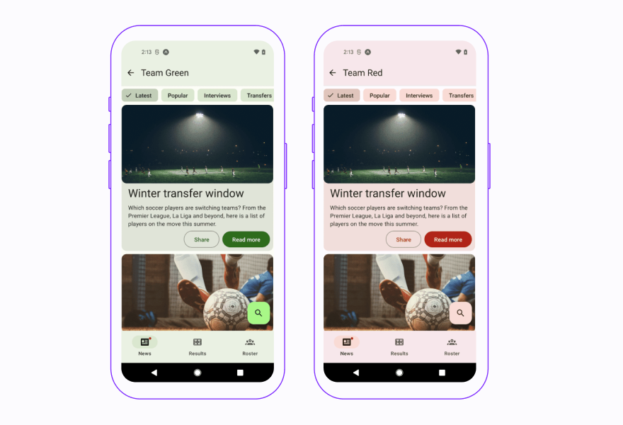
Before reading the article, take a look at React Native Paper demo I prepared, where I show how the new version of the library works.
React Native Paper 5.0 is all about adopting the new Material Design 3, aka Material You, into the library. The new design system generation was released in October 2021 after intense work and effort to make Material You follow a more expressive approach to design.
Version 5.0 brings support for the following Material Design iteration branded as Material You (in fact, Material Design v3 or, in short, MD3) into the react-native-paper library. We refined all components according to the official design kit on Figma and adjusted in terms of visuals by changes in colors, typography, and animations.
Does it mean that v4 won’t be supported anymore?
Technically that’s true – there will be no more releases of v4. Practically, it’s false since Paper version 5.0 supports Material Design generations 2 and 3. Users can keep their existing design with the latest Paper release.
You can think about React Native Paper v5 as an extended and modified (mainly in terms of theming and typography related to Material You) v4.
Introducing Material You (MD3) into react-native-paper doesn't mean dropping previous Material Design (MD2)! On the contrary, both of them will be supported, but not simultaneously.
How to establish which version the app should follow?
To specify which design system components should follow in the app, there is a newly created property in the theme called version, which can accept only one of two values:
- 3 – (default) new Material You (MD3),
- 2 - previous Material Design (MD2).
Helpers
We meet the needs of library users and help them configure the theme in a smooth and hassle-free way. That's why we have created new helper functions and adapted existing ones that will help in this process.
adaptNavigationTheme
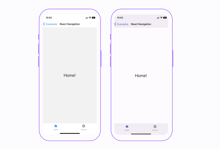
From React Native Paper 5.0 theme colors structure follows the Material Design 3 colors system, which differs significantly from the previous Paper's theme and React Navigation theme.
However, to simplify adapting React Navigation theme colors and to use the ones from React Native Paper, we created the adaptNavigationTheme helper.
The function accepts navigation-compliant themes in both modes and returns their equivalents adjusted to Material Design 3. The adapted theme can then be passed to NavigationContainer so React Navigation's UI elements match React Native Paper color scheme.
configureFonts
In the latest version, we based the fonts in the theme on the variant keys, e.g., displayLarge or bodyMedium. Each variant defines appropriate text styles for type role and size and can be applied by props into text component throughout the whole library.
To make it easier to make theme font changes in terms of modifying individual variants or adding entirely new ones, we adjusted the existing utility called configureFonts.
As of today, the function accepts the config object with font modification appropriate to the Material Design version, where the output is an adjusted theme font object.
createDynamicThemeColors (currently not in the library)
Within Paper documentation in the Theming section, you can find the tool for generating two color schemes, lightScheme and darkScheme, based on the provided source color.
Created schemes follow the Material Design 3 color system and cover colors structure from the Paper theme.
Copied color schemes from the generated JSON can be then used by passing them to the colors in the theme object.
New versions mean new components
The new version of the React Native Paper comes with new components:
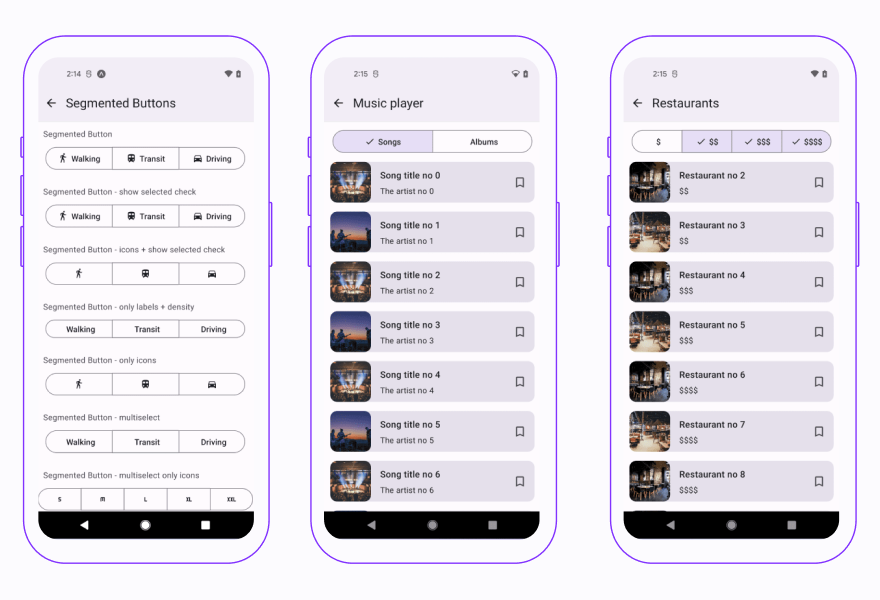
- SegmentedButtons
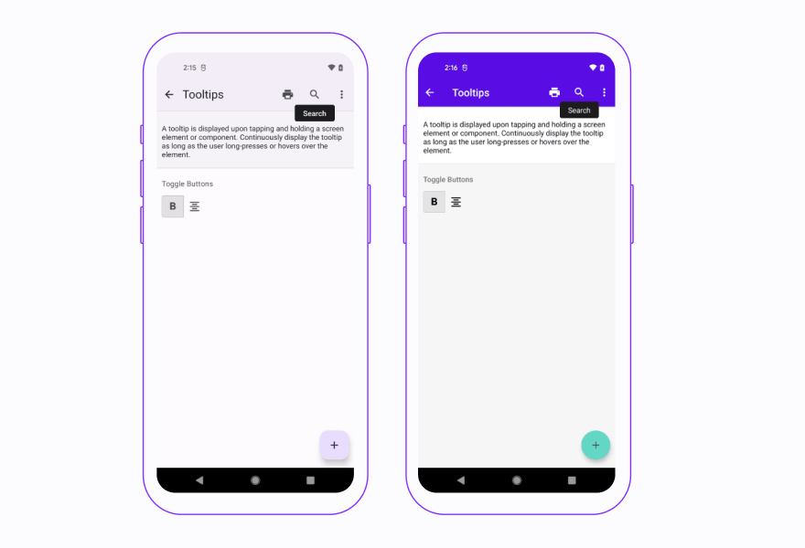
- Tooltip
- Drawer.CollapsedItem
Let’s take a closer look at each component.
SegmentedButtons
SegmentedButtons is a new component introduced in the latest version. However, it can be understood as a refined version of ToggleButton.
It allows you to:
- select options,
- switch views, or
- sort elements.
It's intended to support single and multi-select variants and provide many customization options.
Tooltip
Tooltip is a component displayed upon tapping and holding a screen element or component used to present an informative text label identifying an element, such as a description of its function.
It is one of the components that were missing in the library also in the previous version and, about which there were often questions, so it was high time to introduce it for both Material Design systems!
Drawer.CollapsedItem (Navigation Rail)
Drawer.CollapsedItem is a newly created side navigation component that can be used within Drawer, representing a destination in the form of an action item with an icon and optionally label.
React Native Paper 4.0 vs React Native Paper 5.0
Now that we know what’s new in the React Native Paper 5.0, let’s take a closer look at the differences between React Native Paper 4.0 and 5.0.
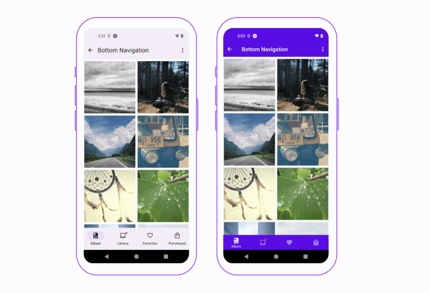
BottomNavigation (Navigation Bar)
In the latest version, Bottom Navigation is taller and doesn’t have a shadow. Active states are represented with filled icons and a contrasting pill-shaped active indicator, while inactive states are represented with outlined icons.
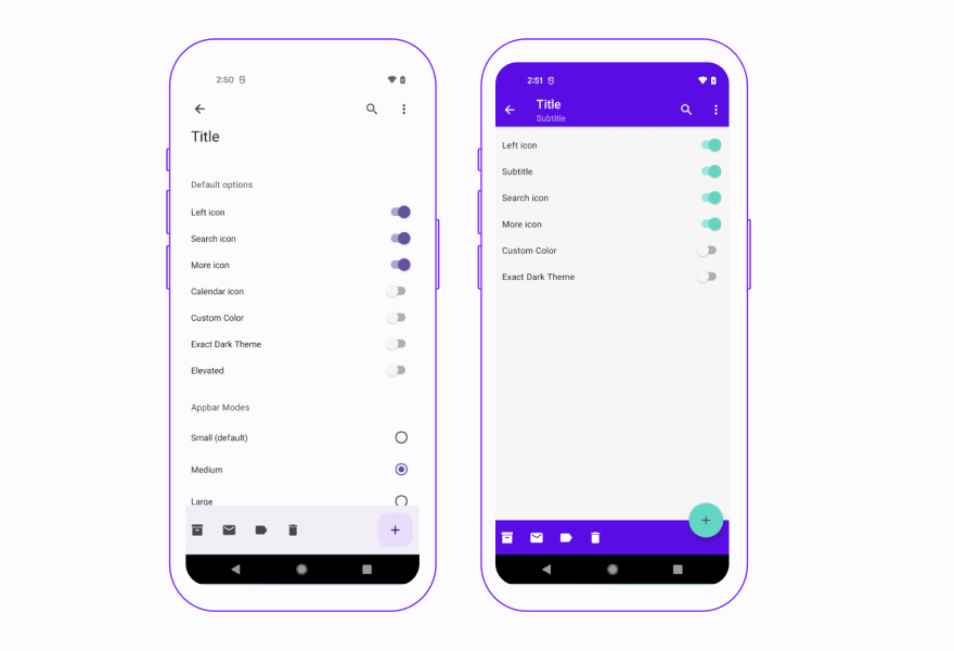
Appbar (Top App Bar)
According to the Material You, there are now four types of top app bar:
- center-aligned
- small
- medium
- large
Each of them has a larger default text and height. Similarly to BottomNavigation there is no drop shadow by default.
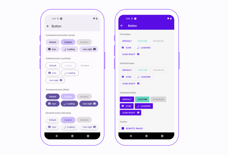
Button
From the perspective of visual changes Button received fully rounded corners, taller height and inner text is sentence case. Button is one of the several components which received new variants or modes – three new types were introduced: elevated, filled and filled-tonal.
In terms of naming, we were looking for some compromise, between being consistent with the codebase and MD that’s why:
- since the filled type replaced what was previously known as a contained button, we decided to stick to that naming, and filled is still named contained,
- accordingly, filled-tonal received the name contained-tonal.
Migration guide
To ease the transition to the new version, we prepared a migration guide to React Native Paper 5.0, covering all of the breaking changes.
Summary
React Native Paper 5.0 offers new versions of new components such as segmented buttons, tooltip, and drawer collapsed item, as well as helpers to make the developers' experience smoother and more enjoyable. Test it for yourself! And if you have any questions about the library, reach out to us via the official Twitter page for React Native Paper.


Learn more about Open Source
Here's everything we published recently on this topic.